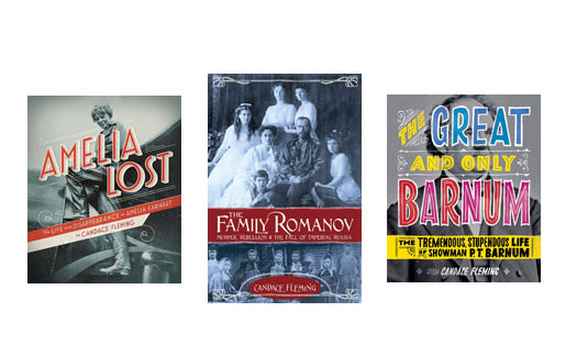
I always come up with the book’s design. It’s such an integral part of the story I’m telling, another way to extend the material. Thus, I always, always have a firm vision of story’s physical appearance.
With the “scrapbook” biographies, I not only researched and chose all the photographs, but I laid the book out as well. Using A‑4 paper, a copy machine, glue sticks and scissors, I physically mapped out the pages, deciding on the order of each picture and entry. No one else could have done that. The order is important to the books’ narrative arcs. It’s part of the storytelling. Of course, what I send to my editor it a terrible mess (sticky, unevenly cut edges, badly copied pages).
Luckily, a designer takes over and makes the pages gorgeous. Still the skeleton is mine. The same process was used for both Amelia Lost and The One And Only Barnum. While neither of these books is a “scrapbook” they do have numerous sidebars and photographs scattered throughout. Once again, I determined where those additional elements fell within the text.
In the case of The Family Romanov, because it reads like I novel, I wanted it to look like a novel – smaller trim size, no sidebars, and photographs in insets rather than scattered across the pages. My editor was a bit hesitant at first, but she’s extraordinarily trusting and generous. Eventually she came around to my way of thinking. I believe it was a good design decision.


2 Responses
Candy, I never knew you had a hand in the design of your books. Very interesting.
Wow! I’m so impressed that you not only have the gift of writing, but of designing your entire book, Candace. Since I am a visual learner, I have enjoyed looking through the pages as well, even though I listened to them on CD. Well done!