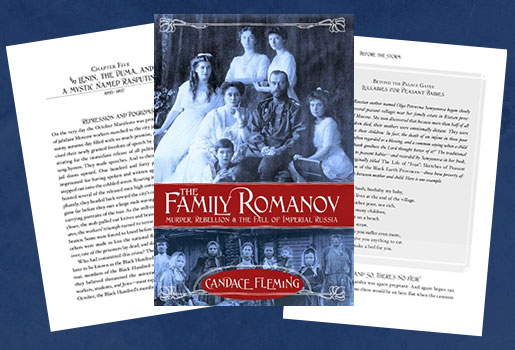
 Many people have asked me about the design of The Family Romanov. Why not scatter those archival photographs throughout the text as is usually done in nonfiction books for young readers?
Because this book demanded something different… something daring.
Let me explain further by revealing the three reasons behind my design choice.
- I wanted the storytelling to do the heavy lifting this time around. My goal was to appeal to kids as readers, not report writers. I wanted The Family Romanov to have a novelistic feel both in the way it looks—small trim size, no sidebars, photographs in insets—and the way it reads. I earnestly believe there are readers out there who crave a narrative nonfiction experience; one that allows them to use their imagination just as they would when reading a novel. We shouldn’t underestimate readers by assuming they need a picture on every page to enjoy and/or understand a true story. After all, none of their big fantasy novels have pictures. Why must their nonfiction? As a wise librarian once told me, “When the text is the star, you remember moments in the story. They linger. They’re vivid. You don’t recall the photographs.” I made the choice to make the story The Family Romanov’s star. There are no captions or sidebars to fragment the reader’s attention. And the book is in no way a visual experience like my previous nonfiction books. Instead, I wanted the Romanovs’ lives to stand out vividly in my reader’s imagination. I wanted them to linger.
- In the last few years, I’ve spent a lot of time talking with middle grade and high school readers about nonfiction. Many have told me that just the look of those highly visual books with their big trim size, captioned photographs, and sidebars discouraged them. “They look like textbooks,” one-eighth grader told me. “They look boring.” So I thought, why shouldn’t these older readers have more nonfiction books that look and read like a novel?
- And finally, since I knew readers for this book would be older, I came to the conclusion that I didn’t need to include dozens of photographs and other visual elements. My readers are savvy. They know how to find information. And in the digital age, myriad photos and film clips of the Romanovs exist online…and they’re just a few clicks away. To help get kids get started, I made sure to include a few great sites in the book’s back matter.


2 Responses
It’s a gorgeous book. I’ve read quite a few adult books about Nicholas and Alexandra and their unfortunate family and ending. This one gave me new material, and an intimate look at the dynamics of that family and how they helped lead the unwitting children to their tragic ending — all delivered tightly and compellingly. I loved it. Great job.
I am not a young reader by any means, but feel your book is mesmerizing and informative as well. The contrast between the peasant and the autocrat is especially compelling and ‘eye-opening’. I have recently been reading MANY books about Nicholas and Alexandra (Helen Rappaport’s biography and the novel, The Kitchen Boy, to name two). Of these three, your book seems to describe Alexandra in the worst light — a religious nut and possibly a hypochondriac. The others described her in a much rosier light. Because the family was eventually murdered, I prefer to think of her as a saintly mother, not an over-protective or mean one (cold baths in the morning, not withstanding). Believe me, I am not criticizing you. I fear your description is the more accurate and that makes me sad.